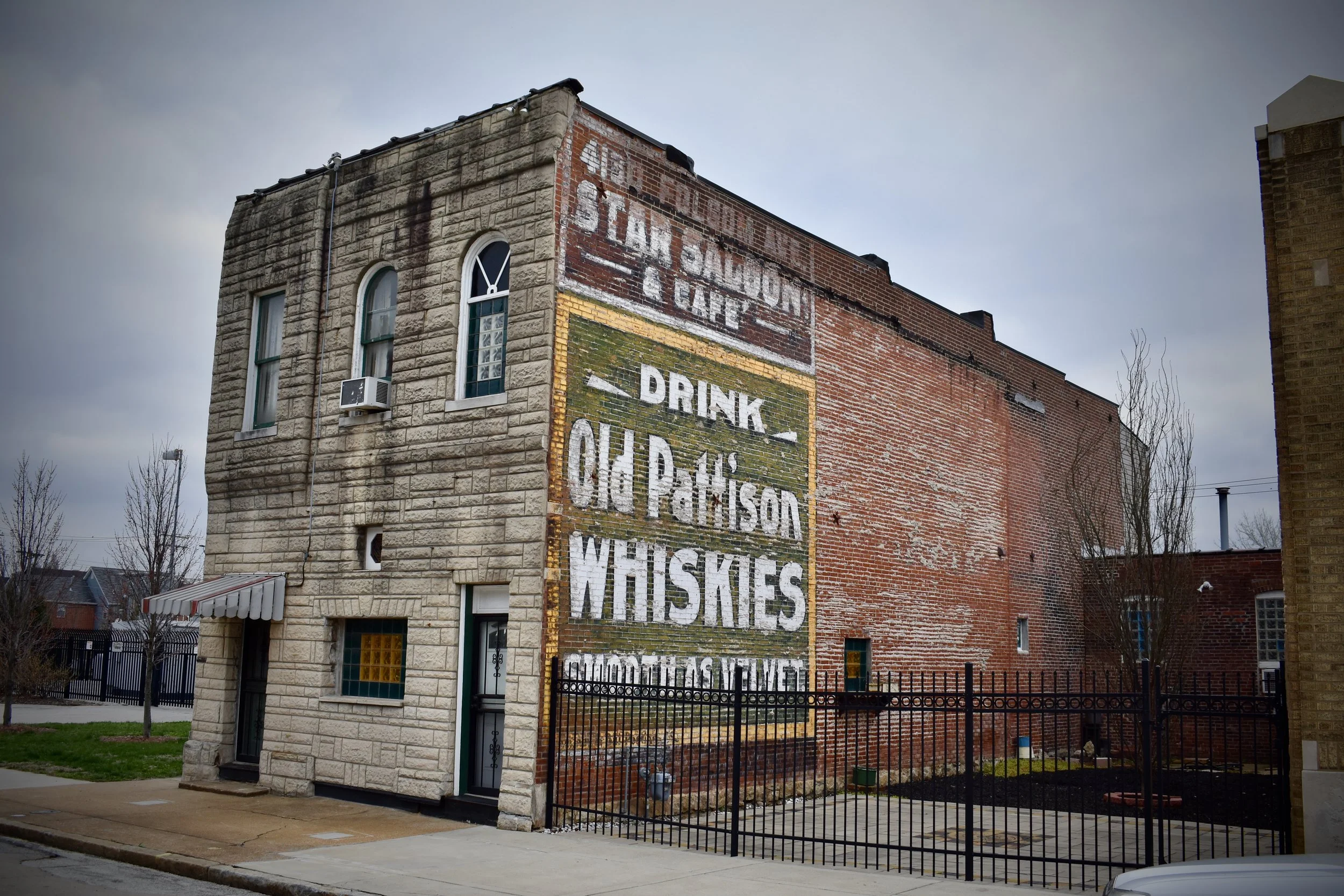
Ghost Signs are painted advertisements or information relayed on brick buildings. They are all over St. Louis, but are disappearing fast. Second only to metal and neon signs, ghost signs are among my favorite things to photograph and stop and take in, no matter where we travel.
One of the best books on the topic is Fading Ads of St. Louis by WM. Stage (2013 History Press). This book has some beautiful black & white and color photography as well as great info on the industry.
Several featured in Stage’s book are now gone, others have been covered up by taggers with grade school level “art”.
So, I’ve got lots of photos that I’ve accumulated over the years, the good ones won’t go up on the internet, but I’ll share some of the average ones here with a little commentary or history.
I will continue to add to this article as I post more photos and info. I’ll send out a Tweet from @STLCityTalk when I make updates.
Ceresota Flour - Clifton Heights Neighborhood
I like the large “C” that grabs your attention on the Ceresota Flour font; but they also used a little boy using a knife to cut through a massive loaf of bread sitting on his lap. Child knifeplay is something that would not be PC today, especially with the business side of that blade heading straight toward Lil' Johnny’s hand and jugular. I love it.
I’m not certain, but I think that is a faded outline of the little boy in the image above from Clifton Heights, just below Ceresota.
WM Stage has a great color photo of a Collinsville, IL ghost sign featuring the little boy.
The best ads have a great font and an iconic image. This has both and is located in an off-the-beaten-path part of town right in a residential neighborhood. It would be a top ten for repainting by my estimation, bringing some interest to the more historic buildings in Clifton Heights, a “newer” St. Louis neighborhood on the southwest side of town.
Here’s some history on the company that gave us this killer ad:
“The Ceresota Brand was born in the late 1800’s from the vibrant flour milling industry in Minneapolis, Minnesota. The Mississippi River below the St. Anthony falls had the perfect conditions for water powered flour mills. By the later part of 1870 there were nearly 30 different flour mills built on the banks of Mississippi river. Eventually these mills began to consolidate and produce flour as one company. One of these companies was the Northwest Consolidated Milling Company which comprised a total of six different mills all producing flour under the same label: Ceresota. It is believed that the Ceresota name was chosen from Greek mythology: “Ce-res”: Goddess of harvest. + “ota” = son. Ceresota: son of Ce-res. The Northwest Consolidated Milling Company was acquired by the Standard Milling Company in April 1902. The Standard Milling Company is now known as the Uhlmann Company.”
The Ceresota Flour brand is way more common in Chicago, their biggest market. Here’s an image below from a Chicago postcard that shows the awesome capital “C” font:
Stay tuned for updates to this post for more ghost signs from St. Louis, MO.


